4 min reading time
How to Create Engaging Images for your eLearning Courses
eLearning images are commonly an afterthought to course content creation. Usually the structure, text, formatting, etc., come first and only then do images come into the picture. This makes sense. Images can be time-consuming to develop, but well-planned images are a crucial part of eLearning. They have big gains for your learners when used throughout their training. Whether you’re using stock or dipping your toe into design, it’s smart to build a repertoire of image tools and resources. To make the most of the images in your eLearning content, we’ve created a comprehensive guide to using images to boost the success of your training – no matter your skill level.
How eLearning images help you and your learners
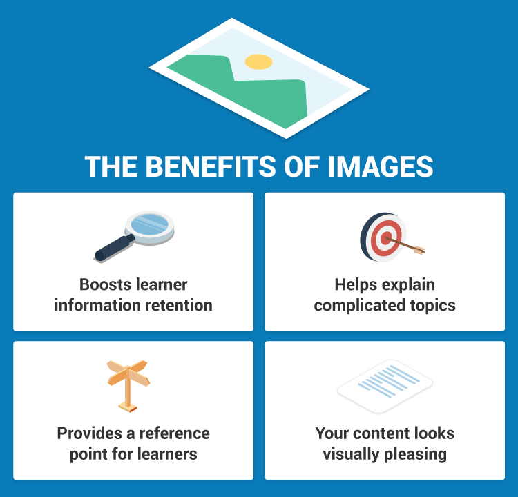
It’s commonly reported that images enhance the learner experience. Here’s how: 
- It helps your learners retain information. According to research, it’s more likely for our brains to memorize and recall information presented in a visual format compared to text.
- With complicated or sophisticated topics, you can help explain them more clearly. You don’t need to write paragraph after paragraph of text to explain a concept. A well-made image can do it clearly and concisely.
- Images can provide a reference point for learners. They are shown a concept in action that they can relate to, and therefore are more likely to understand it.
- Not to be underestimated, images make your course content look visually pleasing too. An attractive course that visually stimulates your learner is more likely to result in them completing their training.
Images to use in your eLearning content
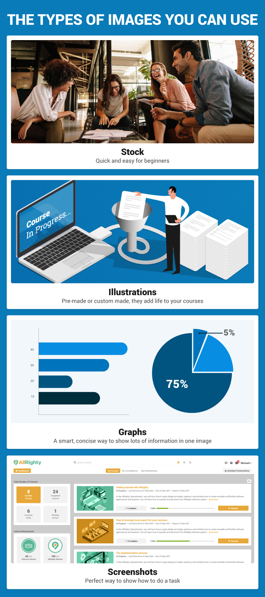
With a vast array of image types available, choosing the right one depends on the training you are delivering and your resources. Most popular are: 
- Stock images: Quick and easy, they are a great choice to add life to your content if you’re a beginner course builder or have limited resources
- Illustrations: Similar to stock images, illustrations can be a simple yet powerful way to add visuals to your eLearning content. They can be custom made if you’ve access to a designer, or you can get pre-made vectors to use.
- Graphs: Diagrams, infographics, charts, are all a smart and concise way to show lots of information in one image. Whether it’s numbers, text or illustrations, this format is an effective way to make your point.
- Screenshots: Great for showing how to use software or do a task, screenshots are a perfect way to visually present what you want your learners to do.
Tools and resources to make your eLearning images
There are lots of resources to avail of when it comes to your eLearning images. Here’s what we recommend: *Remember some are free and some are paid so check the copyright before you use these resources!
Stock Images

Illustrations and graphics

Image building tools
- Piktochart (Infographic maker)
- Canva (Graphic design tool for beginners)
- Venngage (Infographic maker)
- Visme (Infographic maker)

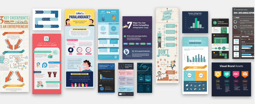
Infographic templates via Visme
- GIMP (Image editor)
- Pixlr (Image editor)
- Photoshop (Image creator and editor)
- Illustrator (Graphics creator)
- Coggle (Mind-map creator)
- Camtasia (Screen recorder)
Tips to successfully use images in your eLearning
With your tools in hand, it’s important that you use images right so that they have the maximum impact. Here are some key points to consider:
1. Choose a style
A homogeneous image style throughout your eLearning content is a smart move as it sets the tone for your courses. Your message is more cohesive overall, your learners see consistency, and become familiar with how the information is being presented. This point is particularly applicable when training customers or partners. Your training content is part of how they perceive your overall brand and making it consistent strengthens their impression of it.
2. Consider your audience
Different audiences react to different images. And not all images are appropriate for every type of training. That’s why the images you choose should reflect the audience you’re trying to engage with. For a corporate office, stock, screenshots, and charts could have the biggest impact. Whereas a less formal environment might react better to cartoon-style infographics.
3. Take your resources into account
Creating original, visually pleasing images for your content is the desired outcome, but not everyone has the resources to do that. If you have design skills or a designer on hand – great! If not, take stock of the resources you have. We listed above the tools you can use to produce good quality graphics and images without design skills. This is a great place to start if you’ve limited resources.
4. Make sure your images have a purpose
Although images have their advantages, when used incorrectly they can have a negative effect. They can distract, confuse and pull your learner’s attention away from what is really important in your training. Use images thoughtfully and carefully. Only add them when it enhances your content and strengthens your message to ensure they have the right impact.
5. Quality, not quantity
Similarly to the above point, badly chosen or poorly designed images can also negatively affect your training outcomes. That’s why it’s best to focus on creating and perfecting a few images that raise the quality of your content, instead of lots of mediocre ones that detract from it.
6. Mix it up
Repetitiveness sparks disinterest so mix it up when it comes to your images. Add a selection of charts, graphics, banners and more to your courses. It will make your images stand out and stick in your learner’s memory for longer.
Build your eLearning image toolkit
The key to success in eLearning is to build a toolkit filled with resources that help you deliver the best training. And your eLearning images are no different. Find the resources that work for you and build from there to achieve training success. Did we miss out on your favorite tool? Let us know in the comments below.


